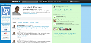
Building A Custom Twitter Background With Adobe Photoshop
With the recent changes to the Twitter platform, it has become more difficult to build a custom Twitter background. The background area of Twitter is not completely fixed. The amount of space that you have to design around the twitter frame varies based on the screen size / resolution of the computer screen that the visitor to your profile is using.
In doing some research for this tutorial I read a lot of different suggestions as to the proper dimension to design around. Most users want the greatest amount of room possible to work with. Myself I would assume design within a smaller space but have a greater guarantee that visitors coming from any computer will be able to see all of my custom content. In short here is an overview:
- 100% of users will always see at least 41 pixels on each side.
- 72% of users (viewing in 1280 x 800 or higher resolution) will see 108 pixels on each side.
- 28% of users (viewing in 1440 x 900 or higher resolution) will see 200 pixels on each side.
- 4% of users (viewing in 1920 x 1080) will see 312 pixels on each side
Bear in mind that in today’s world of tablet computers, netbooks, and smartphones, screens are getting smaller and more portable. I suggest you build within a limitation that will the most widely compatible.
 For users who intend to have a repeatable design that tiles across the screen vertically and horizontally, you really just have to give some thought to how much of your pattern should be visible. More complicated decisions lay with users like myself who want to include images and text within the “sidebar” of the frame.
Because your twitter background will be left top justified you don’t actually need to worry too much about the total dimensions of the background. It could be too small, but it can’t be too big. As a starting point I start with 2376 px wide by 1584 px tall. From there you should use the above guide to determine how may pixels you want to play with on the left side. I would discourage you from designing any pictures or text into the right hand sidebar as it will move under or out from the frame depending on screen size.
Hopefully this tutorial will guide you in designing your new Twitter background.

Jacob, I’ve wanted to build a background for my twitter profile but have no idea how to do so. Where would you point me on how to do it? I would require very specific instructions, written to be understood by the simplest of minds. Any direction you could point me in would be great!
I do all of mine in Photoshop. Essentially you start with a blank slate that is 2376px X 1584px. Then pick a background color or design. From there I like to customize a left hand side “box” where I can put some information. The correct size of that box is what is debatable based on the info above. I think mine at twitter.com/jacobspaulsen is 200 pixels wide. I really will get around to recording a step by step tutorial using photoshop one of these days.